 Nothing screams “amateur” like a poorly crafted book cover. The standards for book design aspired to by trade publishers are not all that high, but self-publishers routinely fall short of them. If you want your book to be taken seriously, package it like you’re serious about it. Perhaps the greatest tragedy in literature occurs when a well-crafted, meticulously edited bookblock is paired with an uninspiring cover.
This article reviews a selection of “professional” book covers to explore what works and what doesn’t in book design. Rather than go straight to the top and bottom of the design spectrum, the examples are pulled at random from Amazon’s Editor’s Choice list. I assume they’re trade-published books but the distinction between traditionally published books and self-published books is irrelevant; good (and bad) book design comes from all corners of the publishing universe. I chose these as a random sample of books that sell well.
Part 1 of this article explores mostly “competent” covers. They aren’t all excellent or groundbreaking, but they convey some sense of professionalism and attention to detail while communicating some essence of what the book is about. As a designer, I care much more for some of these covers than others, but whatever I might think of them, their aesthetic qualities didn’t stand in the way of the books’ success.
If you’re not a graphic designer, this article will help you peek through a designer’s eyes. Design is a somewhat subjective discipline but certain principles of layout and typography generally transcend the stylistic differences that naturally occur between artists. You may disagree with my analysis of these covers, and invariably, many trained designers will, too, but the right designer for you will be able to articulate why she feels certain things will work and certain things won’t. Work with the right professional and you’ll get results that exceed the standards of mainstream publishing.
And before I pick apart my colleagues’ work, consider that many factors will affect the outcome of a design. Time and budget constraints limit the scope of a project. Sometimes a publisher or client stands behind the designer and says “make the type bigger!” or “I like pink!” Commercial art is naturally influenced by commerce, and the artist does not always get things his way. What I label as flaws in some of these designs may very well be beyond the designers’ control.
Book Cover Design: Kate Atkinson’s Life After Life

One small gripe: At every New Year’s Party, one minute after midnight, some idiot says “this is the best time I’ve had all year.” The quote on the cover is about as clever (though it was not likely chosen by the cover artist).
Book Cover Design Principles: Implied Margins
Notice how the title at the top and the credit at the bottom of the image create an imaginary, symmetrical margin on the page. The distance from the edges of the text to the sides of the page is the same as the distance of the text from the top and bottom. Draw a box around the outermost text elements and you’ll see the “box within the box” on the page. Implied margins are subtle but powerful design elements that create depth and hierarchy, and control tension in the image. Lack of consideration given to implied margins is a very common problem with amateur design.
Book Cover Design: Mitchell Zuckoff’s Frozen in Time

My gripes: either enlarge the title text so it bleeds off the page or shrink it so the margins let it breathe. In this case, it’s almost as wide as the page but slightly off to the left (this could be the way the image was captured and posted). This cover lacks typographic hierarchy; the descriptive text is stuck between two pieces of the title that are meant to be connected. The overall arrangement of text is chaotic.
This is ultimately a forgettable cover but for all it lacks, it’s cohesive enough to communicate a mood, a temporal context, and its title and author. People who like adventure books will likely respond to the imagery. For all its flaws, some skilled person invested time and effort to produce this work. The quality is sufficient to distinguish the book from an amateur, DIY production.
Book Cover Design Principles: Distressed Text
A pet peeve shortcut of mine is distressed fonts—letters that have a built-in grunge patterns. Notice how in this case, the E in “FROZEN” has a different wear pattern than the E in “TIME?” This is good. Most amateur designers won’t make the effort to custom-distress their type but distressed text looks much better when no two letters have the same pattern. Points go to Zuckoff’s designer here; good texturing takes time and an available library of textures.
Book Cover Design Principles: Centered Text
I have a general preference against the use of centered text. All rules are made to be broken—you’ll discover notable exceptions—but just as “heaven above” is a weak but far too common rhyme for “love” in songwriting, centered text is an all-too-obvious typographical solution for book covers. Zuckoff’s publisher’s designer made an effort to manually space the letters in “FROZEN” to match the width of those in “IN TIME” but then centered the tagline, the author’s name, and the reference to the author’s previous book. The result is chaotic and confusing. The viewer must sort out several different unrelated fragments of type. The biggest potential problem with centered type is “wineglassing”— the tendency for each line to vary greatly in width. Though the type hardly becomes unreadable, each line of text begins at an unpredictable place. This creates a subtle tension that can hinder a reader’s willingness to engage with (read) the text.
Book Cover Design: Philipp Meyer’s The Son

Philipp Meyer’s The Son conveys a sense of the old west and the wild prairie. Notice how distressed textures were applied to the images in much the same way as on Zuckoff’s Frozen in Time. Just as the setting projects a sense of wide open space, the text floats in an open expanse of negative area. Setting type on top of a photograph can be a difficult chore; it’s a potential design domino that often causes many others to fall in the pursuit of legibility. This designer chose an image that offered plenty of space to set type on. If you like the romance of the wild west, this cover suggests you’ll find it here.
The centered text is not egregious in this example because the width of “SON” and the width of “PHILLIPP” are pretty much the same. The “wineglassing” is minimal and the shape of it (intentionally or otherwise) draws the reader’s eye down into the image. I’m excluding the small words from my judgment of the “wineglassing” effect because they’re intended to be read in contrast with the larger type.
Book Cover Design Principles: The Software Footprint
“The digital footprint” is a common problem. The biggest transgression I see on Meyer’s cover is the “inner shadow” Photoshop filter applied to the title text. The effect of “depth” on the letters is inauthentic; this is not an image that will benefit from obvious digital processing. The cover should look like art, not like a software demonstration. Just as “Crystal Goblet” typography adds flavor to the text while remaining invisible to the reader, the designer’s use of image editing and compositing software should not be obvious to the viewer (especially on a 19th century story). Avoid shadows, glows, bevels and other filters unless you know how to use them to emulate the appearance of natural objects and lighting. The letters on “The Son” could have been made to look like cut paper or peeling paint if the designer had taken more time (or to be fair, had been allocated more time). Instead the “digital” type contrasts against the otherwise “organic” imagery.
Too be fair, this is the kind of stuff that probably only a designer would notice, but these design shortcuts are like using too many initial prepositions in prose. Though they communicate perfectly well, most are lost opportunities to add life and color to a piece.
Book Cover Design: Meg Wolitzer’s The Interestings

Now here’s my question: did the designer intend for the book to communicate this feel? If so, in spite of the absolutely wild centered text, the design is successful; it should appeal to intellectual lovers of modernist literature. Another factor in judging the success of this cover is the age of the target reader. This style will resonate more effectively with older readers; Generation Z will probably feel less nostalgic about the imagery.
The horizontal bars are a challenge to set type on top of. Stay inside the boxes and the design is imprisoned. Set the dark type on the dark stripes and legibility is compromised. I like how Wolitzer’s name is set across three colors; this helps it to “float” on top of the cover art. The title, on the other hand, feels trapped in the yellow box.
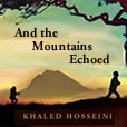
Book Cover Design: Khaled Hosseini’s And the Mountains Echoed

Of all the example covers reviewed in this article, Khaled Hosseini’s And the Mountains Echoed is my least favorite. To some extent it doesn’t matter; Hosseini is an established author signed with a major publisher. His readers will buy his books if they’re wrapped in fish paper, but that doesn’t mean they’re well-designed. The tragedy of this design is that the underlying image is beautiful and provocative. We see foreground, background, contrast, and (I assume) a father running joyfully with his daughter. The image suggests a story—a good quality for a book cover to have.
If the image had been allowed to do the talking (an always encouraged design principle), the type would have been minimized and the effect would have been dramatic. Instead, the ALL CAPITALS, DISTRESSED, CENTERED, ITALIC TEXT is plastered on top of the dark and light areas of the cover like two billboard slogans. The wineglassing is dramatic. The attempt to mimic the “echoing” of the mountains by using three sizes of text in the title simply fails; it’s cheap typographical theatrics that obliterates the power of the image beneath. And though I like distressed text, I’m unclear about what it suggests here. It doesn’t place the work in a particular time period, and it grates against the author’s earlier writing credits which are set with a square, condensed sans-serif reminiscent of the text at the bottom of movie posters. By attempting to convey artful literature with a Hollywood blockbuster poster aesthetic, the design falls apart.

My guess is that Hosseini’s publisher decided to leverage his “star power” as a successful author. In doing so, it removed all suggestion of elegance, eloquence, depth, sophistication, and class. This isn’t a heavy metal album; it doesn’t need to be thrust in the reader’s face. The echoes from these mountains should not be blasted through a megaphone pointed at your ear.
Book Cover Design: Conclusions
I’m fond of saying that “great design is a process of subtraction.” Rarely will you improve a piece of art by adding content or enlarging design elements. Pull back. Reduce. Let the images speak so the text doesn’t have to. A book cover is not a circus poster; it should represent the tone, time, and spirit of the literature it contains.
Consider the importance of implied margins to “steady” a layout. Avoid centered text and superfluous digital effects. Use photographs of real textures instead of pre-distressed typefaces to produce authentic “organic” design.
Established publishers are constrained by time, budget and taste just like other publishers are. Smart self-publishers leverage this opportunity to exceed industry standards by working with capable designers, typesetters, and editors. If you don’t have a solid grasp of design, layout, and typographic principles, don’t design your own cover. The difference may not be obvious to you but an amateur design deters readers, contests, and reviewers from taking your book seriously.
A book cover does not have to attain the status of fine art to be effective, attractive, and functional. Some of these book covers represent the work of major writers and publishers; their books are selling even though the cover art falls well short of the quality we expect of the literature. Self-publishers don’t have to reach very high to meet this standard; there’s simply no excuse not to.
Part 2 of this article will examine a number of covers that were probably not designed by professionals. It’s easy to say they’re ‘bad” or that they “don’t work,” but the article will examine why. By applying a few design principles and exposing cliché solutions, we can learn a great deal from the well-intentioned mistakes of others.
 Consider also the role of the cover in the shopping scenario. In days of yore, people went to bookstores, got attracted by a cover, read the back, tried a few pages, and purchased a book. (Old vinyl record stores were like art galleries for the same reason). That still happens but less often than it used to; books are not the impulse items they once were. “Postage stamp” covers on eBook app stores are revealed after the reader has found the book through a topic search, a review, a recommendation or by some other means. Rather than having to compete for a reader’s attention as she peruses the stacks, the cover sets the tone and projects standards of quality after the book’s page is being viewed—in isolation from other books. With space limited, “show, don’t tell” becomes even more important. A strong image and a title are primary elements. Anything else, including the author’s name, can be found elsewhere on the book’s bookstore page. Better to leave that tiny cover graphic uncluttered so it can encourage readers to explore more deeply.
Continue to Part 2 of Book Cover Design — Judging a Book by Its Cover


